
The MOST important thing to learn to improve your art drastically ✨ How to use value in art (lights and darks)
Hi everyone, welcome to my new studio blog.
In this video, I’m going to share the one thing to learn to improve your art drastically.
For the last year and a half I’ve been immersing myself in learning as much as I can to improve my artwork, find a process I love, and to find my own unique style. And during this journey, I’ve learned something that has drastically changed my art, and it is (in my opinion) the most important thing to learn when it comes to making art.

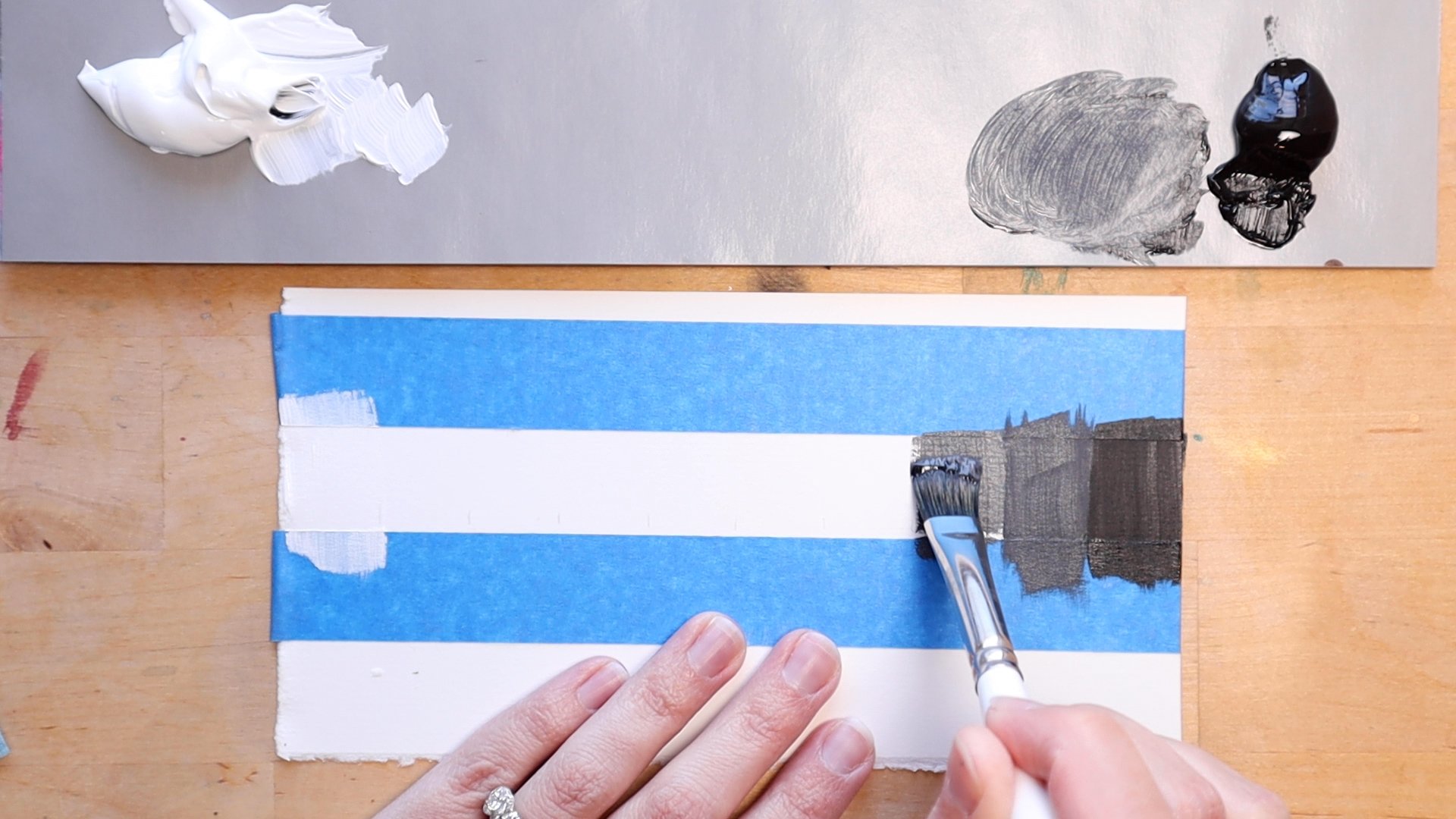
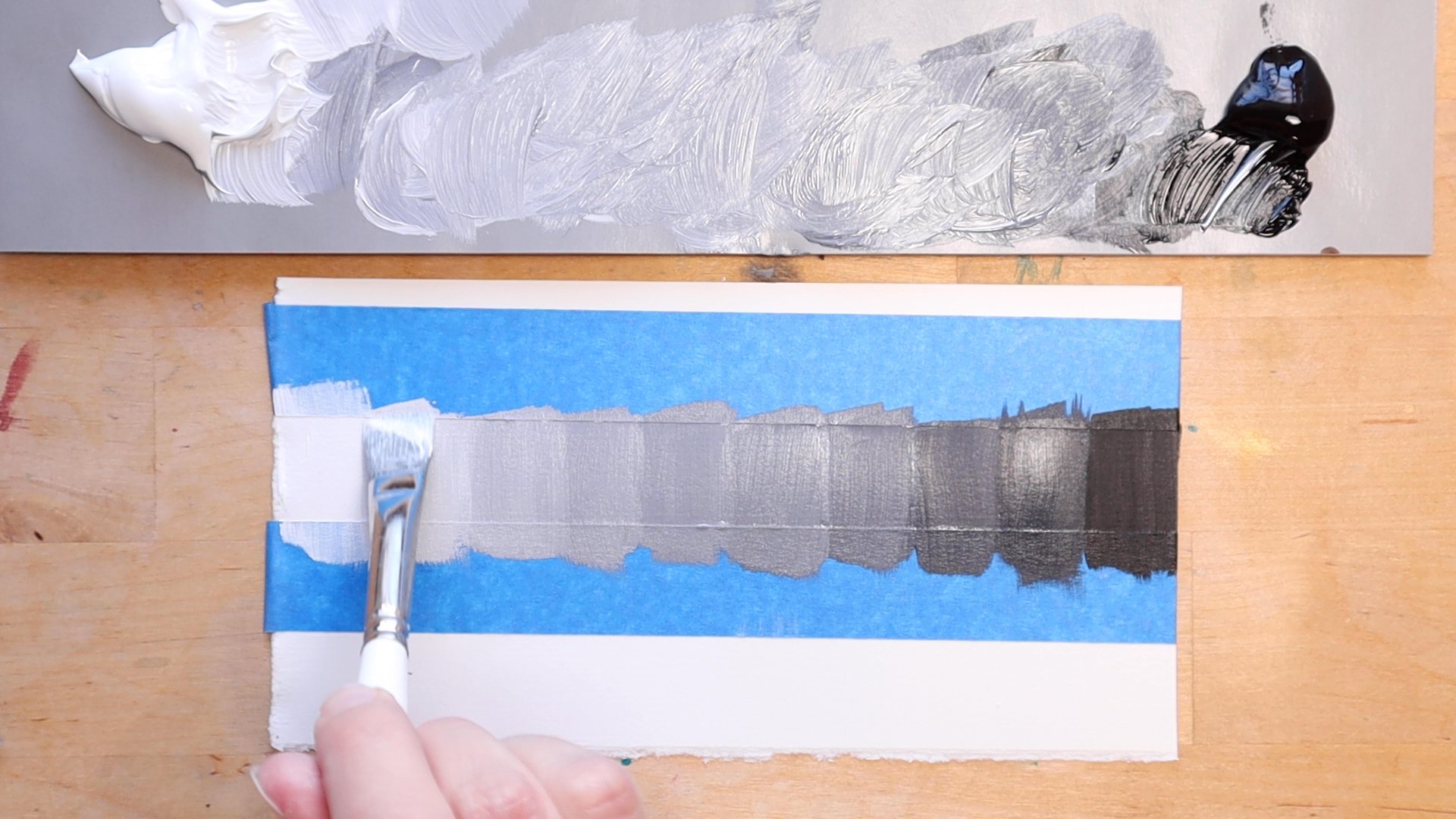
The most important thing is to use all 10 values on the value scale in your art. Here is a look at what the value scale looks like. You can also search value scale on the internet to find photos.

In case you need a refresher, value is the lightness and darkness of a color.
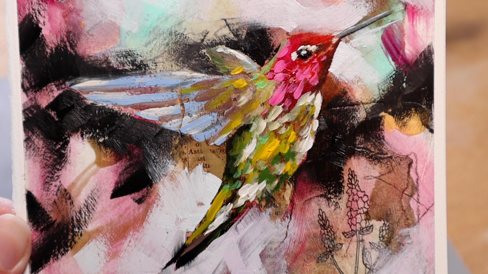
Using all ten values in your art will increase the contrast, give more depth, make your art look more interesting, and make your art more sellable if you choose to sell.
Art can look amateur and flat if only values 3-8 are used, or if an artwork only has midtones and no highlights or dark darks.
Warm colors are lighter in value than cool colors. So, if you want to increase the light in your painting, use warm colors (yellow, orange). If you want to increase the darks in your painting increase the cool colors (blue, purple).
An easy way to be sure to increase your darks and lights and up the contrast, is to paint lights right next to darks, especially where your focal point is. The term for this is chiaroscuro and I’ll put that in text on the screen because the spelling is a little complicated.
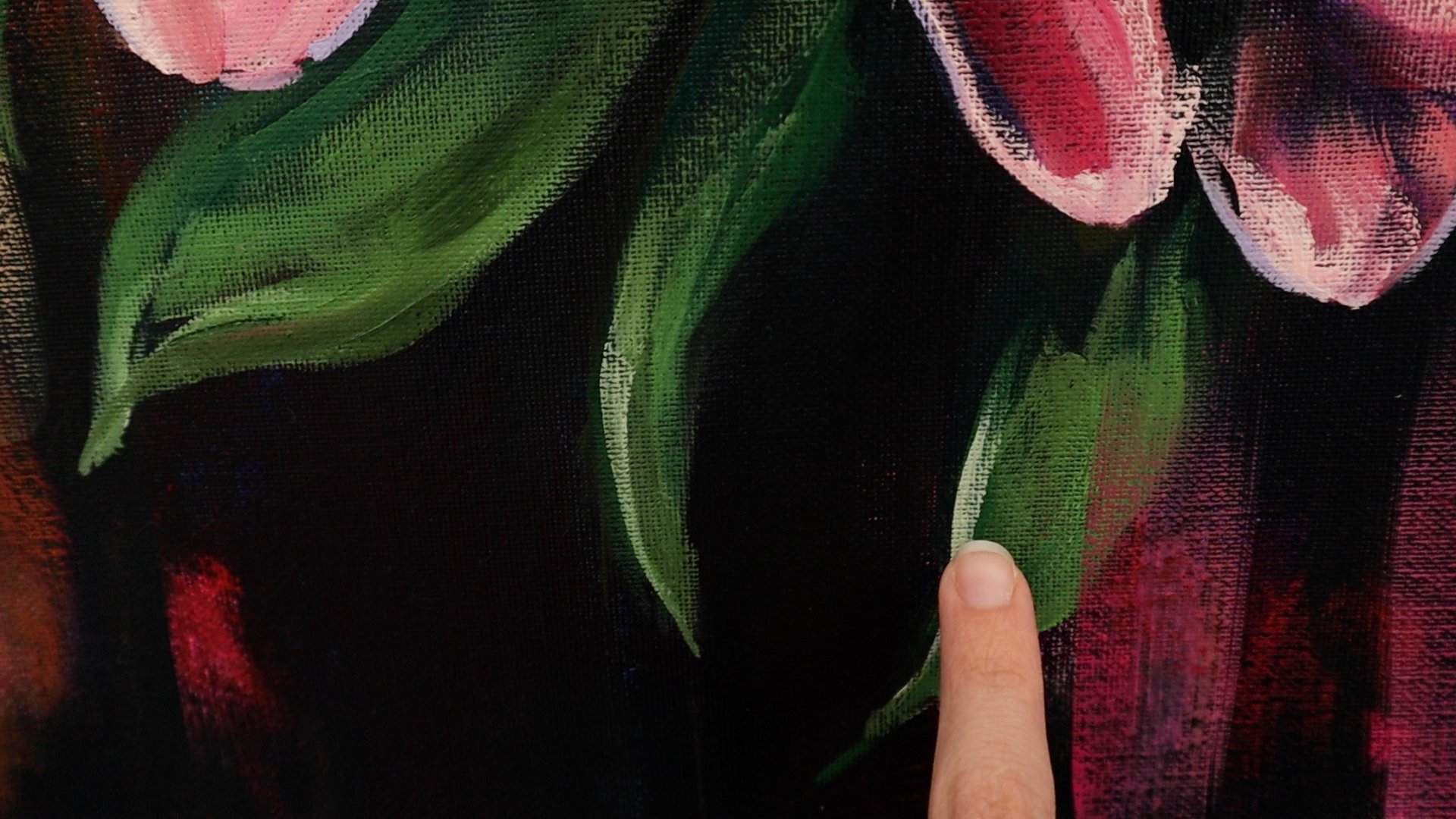


Another way to look at value is what colors you use. You can use complimentary colors next to each other to increase the value of that area. I like to do this with the focal points of my paintings.

Purple and Gold Yellow

Orange and Blue
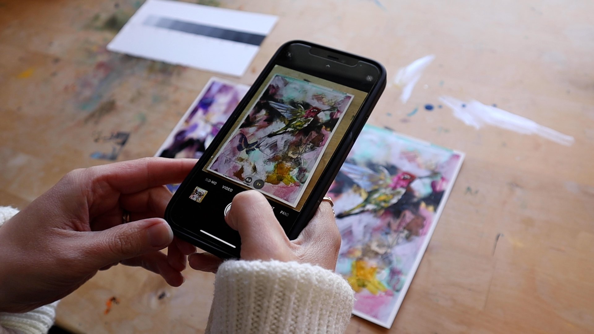
Here’s a tip to see if your art needs more lights or darks: take a photo of your art and then decrease the saturation of the photo all the way to turn it to black and white.
This will help you see the values better.


If you’d like to practice this, you can make a value scale like I did in this video. I used Stonehenge watercolor paper and black and white acrylic paint. You can make this with any medium you choose.

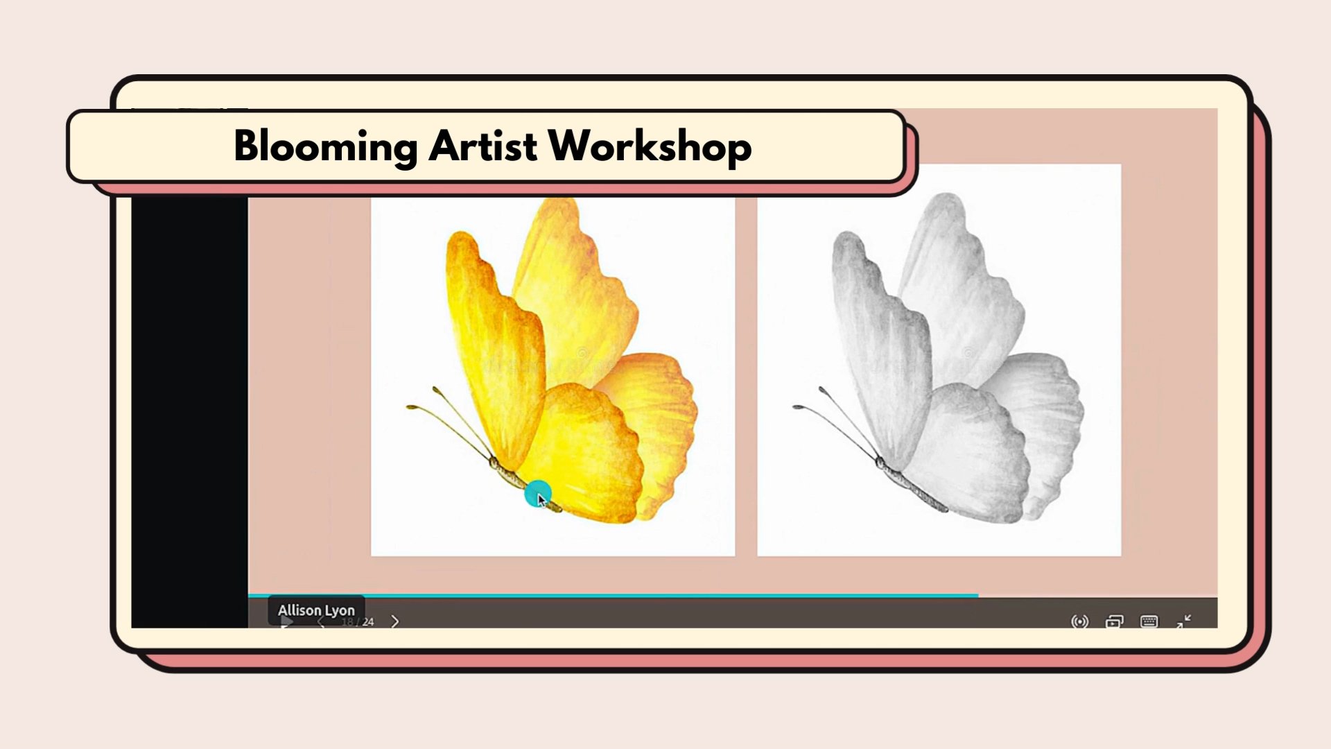
If value is something you want to improve on, you may like a workshop I have available on how to use value successfully. I share even more ways to increase the value in your art that I didn’t share in this video. I also show examples of art that use the value scale successfully and ones that need a bit more work. You can find the link below.
Workshop► https://allisonlyonart.teachable.com/p/the-one-thing-to-learn-to-improve-your-art-drastically
Feel free to join my blooming artist newsletter down below where I share my best artist tips with you every other week.
https://allisonlyonart.live/artisttips
Thank you so much and I’ll see you in the next blog post!
